# CSS Element Queries
[](https://gitter.im/marcj/css-element-queries?utm_source=badge&utm_medium=badge&utm_campaign=pr-badge)
Element Queries is a polyfill adding support for element based media-queries to all new browsers (incl. IE7+).
It allows not only to define media-queries based on window-size but also adds 'media-queries' functionality depending on element (any selector supported)
size while not causing performance lags due to event based implementation.
It's a proof-of-concept event-based CSS element dimension query with valid CSS selector syntax.
Features:
- no performance issues since it listens only on size changes of elements that have element query rules defined through css. Other element query polifills only listen on `window.onresize` which causes performance issues and allows only to detect changes via window.resize event and not inside layout changes like css3 animation, :hover, DOM changes etc.
- no interval/timeout detection. Truly event-based through integrated ResizeSensor class.
- automatically discovers new DOM elements. No need to call javascript manually.
- no CSS modifications. Valid CSS Syntax
- all CSS selectors available. Uses regular attribute selector. No need to write rules in HTML/JS.
- supports and tested in webkit, gecko and IE(10+)
- `min-width`, `min-height`, `max-width` and `max-height` are supported so far
- works with any layout modifications: HTML (innerHTML etc), inline styles, DOM mutation, CSS3 transitions, fluid layout changes (also percent changes), pseudo classes (:hover etc.), window resizes and more
- no Javascript-Framework dependency (works with jQuery, Mootools, etc.)
- Works beautiful for responsive images without FOUC
More demos and information: http://marcj.github.io/css-element-queries/
## Examples
### Element Query
```css
.widget-name h2 {
font-size: 12px;
}
.widget-name[min-width~="400px"] h2 {
font-size: 18px;
}
.widget-name[min-width~="600px"] h2 {
padding: 55px;
text-align: center;
font-size: 24px;
}
.widget-name[min-width~="700px"] h2 {
font-size: 34px;
color: red;
}
```
As you can see we use the `~=` [attribute selector](https://developer.mozilla.org/en-US/docs/Web/CSS/Attribute_selectors).
Since this css-element-queries polyfill adds new element attributes on the DOM element
(``) depending on your actual CSS and element's dimension,
you should always use this attribute selector (especially if you have several element query rules on the same element).
```html
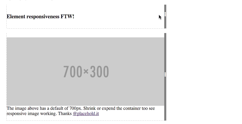
Element responsiveness FTW!
```
### Responsive image
```html
```
Include the javascript files at the bottom and you're good to go. No custom javascript calls needed.
```html
```
## See it in action:
Here live http://marcj.github.io/css-element-queries/.
## Module Loader
If you're using a module loader you need to trigger the event listening or initialization yourself:
```javascript
var ElementQueries = require('css-element-queries/src/ElementQueries');
//attaches to DOMLoadContent
ElementQueries.listen();
//or if you want to trigger it yourself.
// Parse all available CSS and attach ResizeSensor to those elements which have rules attached
// (make sure this is called after 'load' event, because CSS files are not ready when domReady is fired.
ElementQueries.init();
```
## Issues
- So far does not work on `img` and other elements that can't contain other elements. Wrapping with a `div` works fine though (See demo).
- Adds additional hidden elements into selected target element and forces target element to be relative or absolute.
- Local stylesheets do not work (using `file://` protocol).
- If you have rules on an element that has a css animation, also add `element-queries`. E.g. `.widget-name { animation: 2sec my-animation, 1s element-queries;}`. We use this to detect new added DOM elements automatically.
## License
MIT license. Copyright [Marc J. Schmidt](https://twitter.com/MarcJSchmidt).